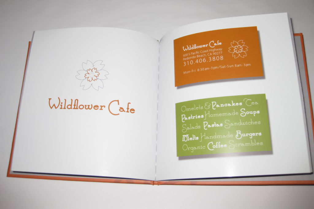
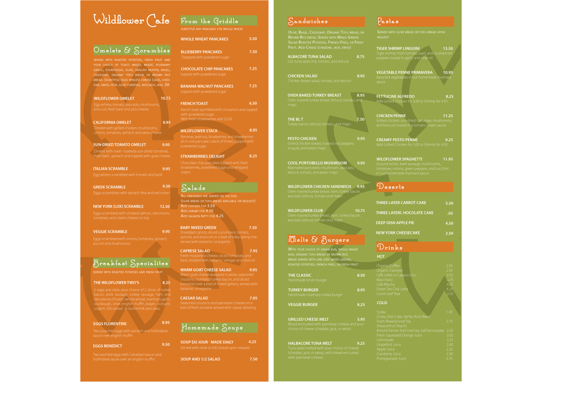
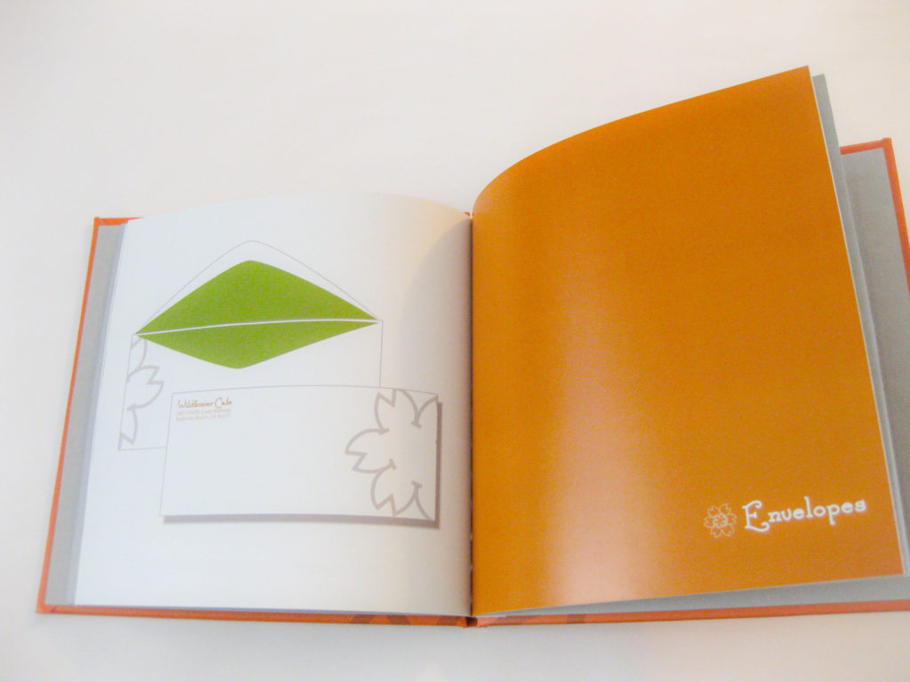
This project was based on re-branding and re-designing a local business. I chose one of my favorite cafe’s which served amazing food but had a branding style that was all over the place. The signs, the menus, the logo were all different from one place to the next. This is my submission for their re-branding. I chose an avocado green and burnt orange color scheme along with a fun, funky typeface which alluded to their natural foods menu and a fun daytime vibe.
I was able to take the capital W from the typeface and multi-purpose it into many background, letterform and package elements.
The whole project was uploaded and published into a hardbound book through BLURB.
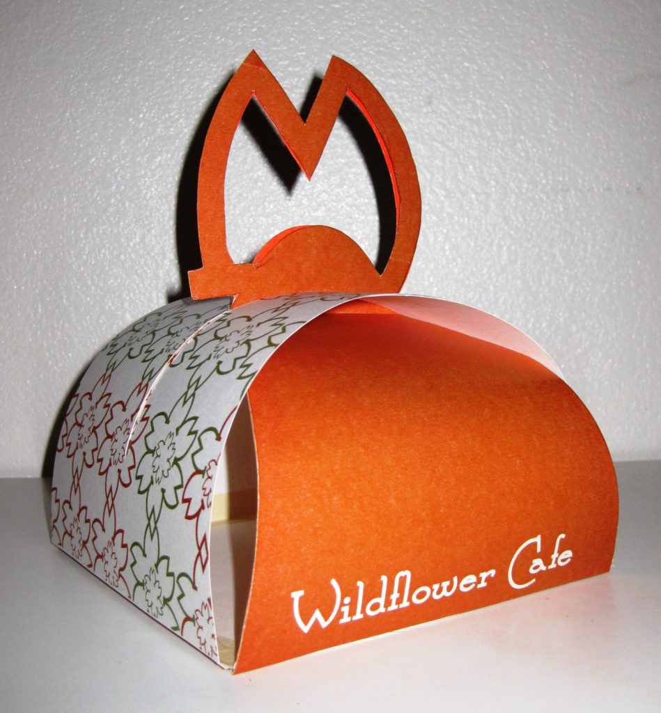
Take-Out Packaging Prototype

