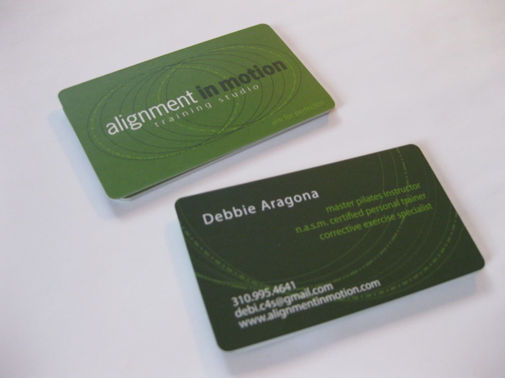
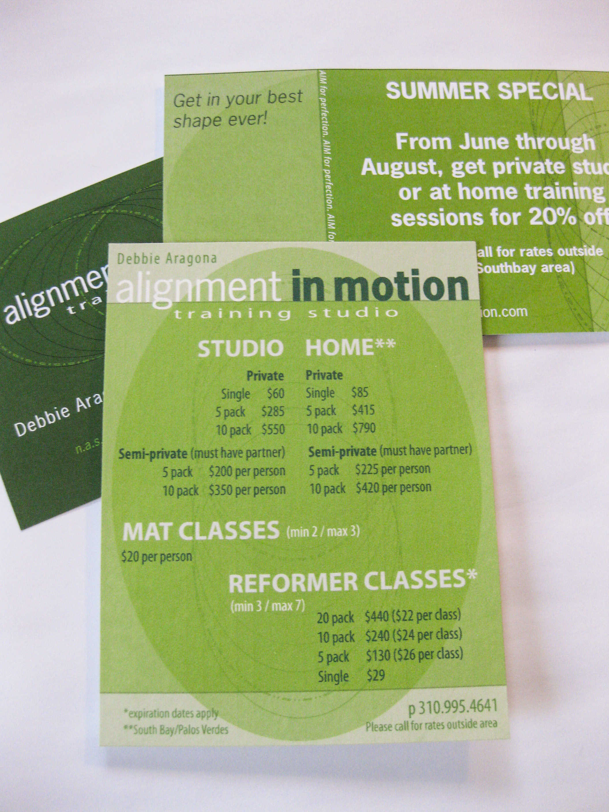
This project was created for a local fitness instructor and her company in Manhattan Beach, CA. She requested a logo and business card set that embodied her specialty of spinal alignment and proper posturing while working out.
I created a custom interlocking spiral graphic to reflect the movement of the body and the spine, that also plays as a moving visual eye illusion.
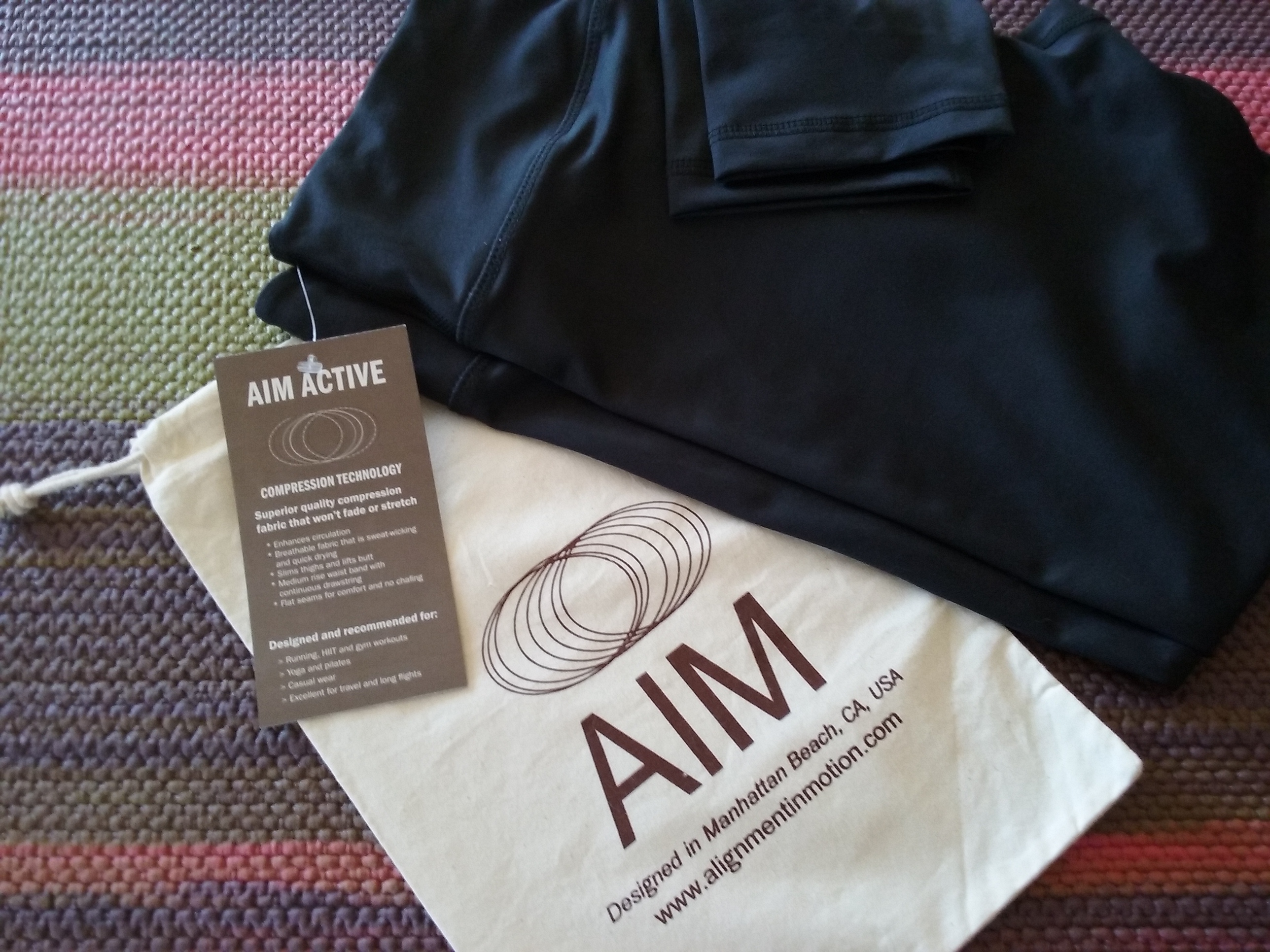
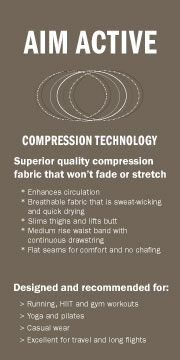
The original logo, rate cards and spiral graphic were designed in a green color scheme. In 2015, we updated the color scheme to a neutral and the logo was adjusted to a slightly more modern aesthetic. I replaced the heavy block type with an indented lighter version to reflect movement, incorporating a piece of the spiral graphic into the logo name. The final design was used for a hang tag for her athletic pant line.
